
I’ve been making political cartoons and producing general illustrations for around 3 years. The drawing process is forever challenging. But for all the difficulties, there is one stand out lesson that I’ve learnt: you cannot be consumed by the difficulty of the moment – you need to stand back and look at the process from a distance and see art and drawing as a journey.
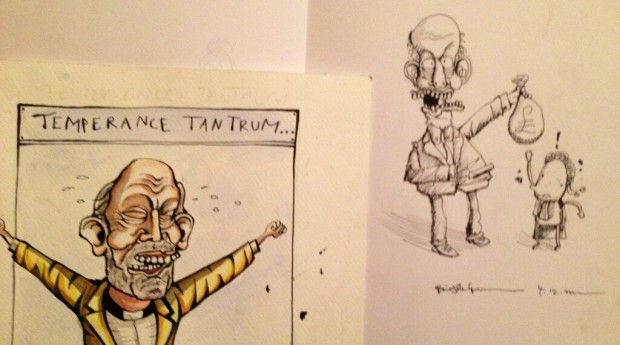
I took a lot of comfort and reassurance when I compared the two pieces I had done in the image above of Northern Ireland Justice Minister and leader of the Alliance Party, David Ford. The cartoon on the left was done in April 2012, while the one on the right was produced in October 2012.
When put side by side, compared and contrasted, I could see a huge difference and most importantly: a huge improvement. The one on the left is pretty clumsy and crude; while on the right, my piece looks more mature, rounded and sophisticated.
Doing political cartoons is incredibly challenging. Plain and simple. Whether or not I have the ability to make it as a leading political cartoonist I don’t know. But what I do know is that one cannot get caught up in the immediate challenge that drawing poses. Aspiring artists need to persevere and drive through the pain barrier. By taking a long view and seeing drawing as a journey you can over leap the challenge posed in the immediate term.
In the images below I have included the work of some of Britain’s leading political cartoonists. I’ve done it in a way to show how their work has developed. In the first pieces their interpretations are, like mine, clumsy and crude; but with the passage of time, their standard of work improves measurably.
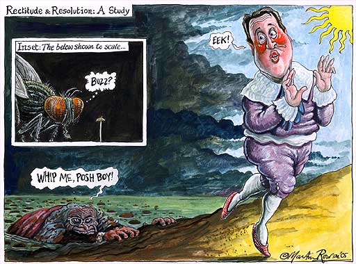

In the cartoons above David Cameron is pretty fresh on the scene. It’s clear to see that Rowson is still working on catching the likeness and as you look and compare the 3 cartoons you can see incremental improvements and developments.
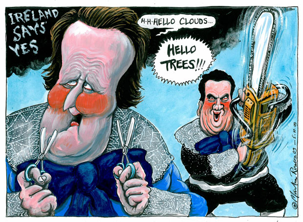
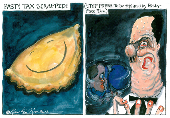
If you then compare the two cartoons below with the three above you can see a massive difference. Rowson has broken through the pain barrier and really broken into his artistic stride with style and confidence. Great to see!

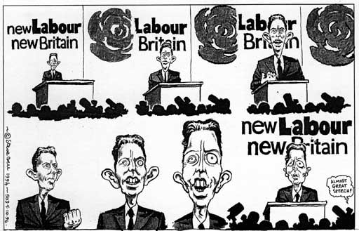
Compare Steve Bell’s interpretation of Tony Blair above and below and the difference is stark. The cartoon above of Tony Blair is from the days before his premiership and is pretty primitive compared to his later works. You can see Steve Bell picked up on Tony’s mad eye very early. It looks as though he tried to bring in a Thatcher-twist to the mad eye though which later disappeared.
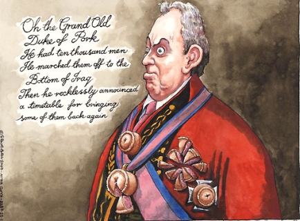
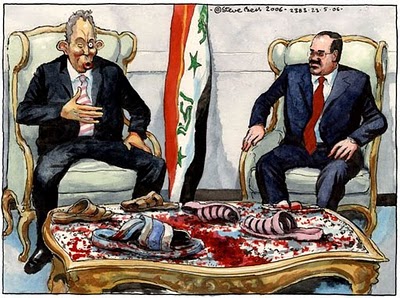
In the cartoon of Tony below the former Prime Minister was well into his premiership and embroiled in controversy around his warmongering.
Morten’s cartoon of David Cameron above and below stand in stark contrast. The one above is from 2005 and the one below from 2013. It just goes to show what years of practice and studying a person’s face can do!

The late Ronald Searle is unquestionably one of the most iconic, revered and most looked-up-to cartoonist there’s ever been. But even he went on a journey; he didn’t get good over night. And that’s the problem: cartoonists in their infancy simply think that the top guys always drew like that. That’s simply not the case.
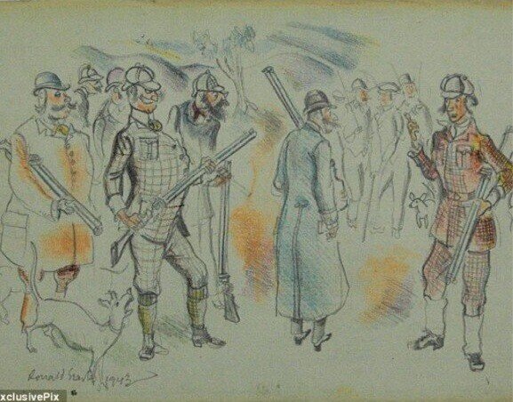
Look at Searle’s cartoon above from 1943 and you can see that it’s rather simplistic and crude with clumsy and formulaic lines.
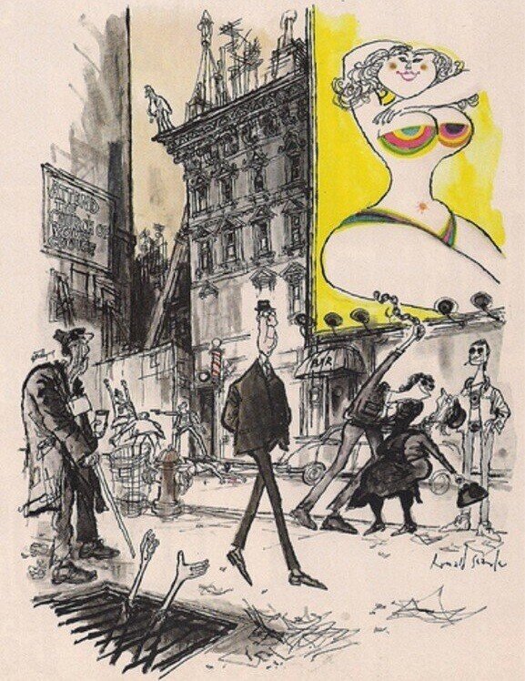
Compare it to his later work below and the two pieces are hugely different. The work below is Searle at his best; free-flowing and loose line work that captures the spirit of the moment and the personality of the people captured.
Bit of further reading:
The Guardian recently picked up on the evolution of Steve Bell‘s work.
Martin Rowson produced a guide to drawing Prime Minister, David Cameron.
No comments:
Post a Comment